
How to Create Quality Tables And Charts with ChatGPT in 5 Steps
Learn to make clear, useful tables & charts without complex data uploads.

Here’s how to do it (step-by-step):
Step 1: Start with Basic Information
Begin by asking ChatGPT for simple data.
Prompt: "List the top five social media platforms by monthly active users in 2024."
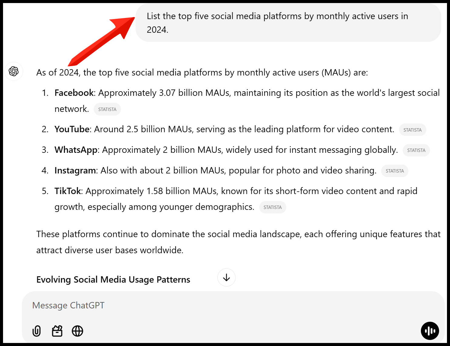
Analysis: Start with simple lists before moving to visual formats.
Step 2: Convert to Table Format
Turn your list into an organized table.
Prompt: "Make a table of the top five social media platforms by monthly active users."

Analysis: Tables organize information more clearly than lists.
Step 3: Add Meaningful Comparisons
Make your data more insightful by adding context.
Prompt: "Add a column showing year-over-year growth percentage for each platform and sort by highest growth."

Analysis: Adding growth trends helps spot market opportunities and platform momentum.
Step 4: Create a Bar Chart
Turn your data into a visual chart.
Prompt: "Make a bar chart of the top five social media platforms by monthly active users."

Analysis: Bar charts help visualize differences in numbers.
Step 5: Add Comparative Elements
Make your chart more informative with multiple data points.
Prompt: "Create a split bar chart showing both mobile and desktop users for each platform. Use different shades to distinguish them."

Analysis: Showing multiple metrics in one chart helps spot platform usage patterns and opportunities.
Pro Tip: Keep your prompts simple and clear for the best results.
Hi there, thanks for making it to the end of this post! My name is Azhar, and I’m an AI enthusiast passionate about exploring the latest news, guides, and insights in the world of generative AI. If you’ve enjoyed this content and would like to support my work, consider becoming a paid subscriber to my publication. Your support means a lot!